z-index
- HTML 요소의 위치를 설정하게 되면 위치 및 방식에 따라 요소가 겹칠 수 있는데, 겹쳐지는 요소들의 순서를 결정할 때 사용한다. 순서는 숫자의 크기가 클수록 위에 위치하고 작을수록 아래에 위치하게 된다.
# 사용 방법
요소 {
	css 코드
    z-index: 숫자;
}<!DOCTYPE html>
<html lang="en">
<head>
<meta charset="UTF-8">
<meta name="viewport" content="width=device-width, initial-scale=1.0">
<title>z-index</title>
<style>
div#wrapper { position: relative; }
div.box {
position: absolute;
width: 200px;
height: 200px;
border: 1px solid black;
font-size: 25px;
}
#b1 {
left: 50px;
top: 50px;
background-color: deeppink;
z-index: 100;
}
#b2 {
left: 120px;
top: 70px;
background-color: gold;
z-index: 1;
}
#b3 {
left: 70px;
top: 110px;
background-color: deepskyblue;
z-index: 10;
}
</style>
</head>
<body>
<h2>z-index</h2>
<div id="wrapper">
<div id="b1" class="box">1번째 div</div>
<div id="b2" class="box">2번째 div</div>
<div id="b3" class="box">3번째 div</div>
</div>
</body>
</html>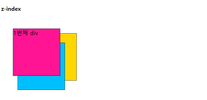
float
- HTML 요소가 수평으로 나열된 주변의 다른 요소들과 자연스럽게 어울리도록 만든다.
- float를 적용받은 요소의 다음에 나오는 모든 요소들이 끌어올려지고, 요소의 뱡향은 left, right로 결정한다.
- 컨텐츠의 크기만큼만 영역을 설정하고, float를 적용받은 요소는 다른 요소(배경)보다 위에 위치하게 된다.
# 사용 방법
요소 {
	css 코드
    float: 설정값;
}<!DOCTYPE html>
<html lang="en">
<head>
<meta charset="UTF-8">
<meta name="viewport" content="width=device-width, initial-scale=1.0">
<title>float1</title>
<style>
img {
float: left;
margin-right: 20px;
}
</style>
</head>
<body>
<h2>float1</h2>
<img src="./gift_icon.png" alt="선물 이미지">Lorem ipsum dolor sit amet consectetur adipisicing elit. Quasi reiciendis sint enim ipsa dolorum sed ad eius nihil assumenda, perferendis atque quaerat sequi? Corporis aut sunt earum error libero molestiae!
</body>
</html>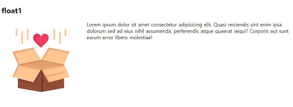
여러 개
<!DOCTYPE html>
<html lang="en">
<head>
    <meta charset="UTF-8">
    <meta name="viewport" content="width=device-width, initial-scale=1.0">
    <title>float2</title>
    <style>
        div {
            padding: 20px;

        }
        #box1 {
            background-color: gold;
            float: left;
            margin-right: 20px;
        }
        #box2 {
            background-color: deeppink;
            float: left;
            margin-right: 20px;
        }
        #box3 {
            background-color: greenyellow;
            float: left;
            margin-right: 20px;
        }
        #box4 {
            background-color: deepskyblue;
            float: right;
        }
    </style>
</head>
<body>
    <h2>float2</h2>
    <div id="box1">박스1</div>
    <div id="box2">박스2</div>
    <div id="box3">박스3</div>
    <div id="box4">박스4</div>
</body>
</html>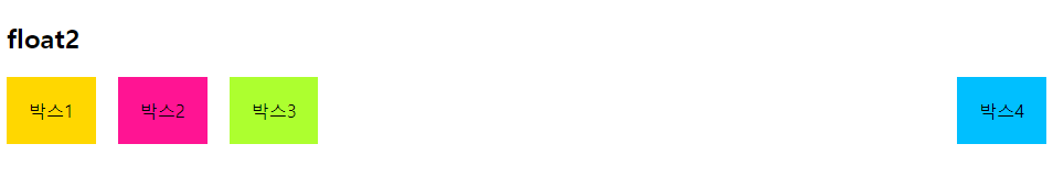
박스 1과 박스 2만 놓고 보면 박스 1 텍스트 상자를 제외하고 background색은 박스 2의 색상이다.
그 후 박스 3을 추가하게 되면 박스 1,2 텍스트 상자를 제외하고 모두 박스 3의 색상으로 들어간다. 여기서 마진으로 남겨진 빈 공간에도 들어가게 된다.
하지만 마지막에 흰색상이 나오는 이유는 박스 4를 오른쪽으로 시작점을 잡았기 때문이다.
clear
- float 속성이 적용된 이후에 나타나는 요소들의 동작을 조절한다.
- float 속성이 적용되면 그 이후에 나오는 모든 요소들은 정확한 위치를 설정하기 힘들다.
- clear속성(left, right, both)을 이용하여 float 이후에 등장하는 요소들이 더 이상 float 속성에 영향을 받지 않도록 설정한다.
# 사용 방법
요소 {
	css 코드
    float: left;
}
요소 {
	css 코드
    float: left;
}
요소 {
	css 코드
    clear: 설정값;
} # float의 영향을 받고싶지 않은 마지막 요소에 작성clear를 사용하지 않았을 때
<!DOCTYPE html>
<html lang="en">
<head>
    <meta charset="UTF-8">
    <meta name="viewport" content="width=device-width, initial-scale=1.0">
    <title>clear</title>
    <style>
        body {
            margin: 20px 30px;
            max-width: 800px;
        }
        p {
            padding: 10px;
            text-align: center;
            font-size: 20px;
        }
        #p1 {
            float: left;
            width: 38%;
            background-color: gold;
            margin-bottom: 20px;
        }
        #p2 {
            float: right;
            width: 54%;
            background-color: deepskyblue;
        }
        #p3 {
            background-color: deeppink;
        }
    </style>
</head>
<body>
    <h2>clear</h2>
    <div id="p1">
        <p>Lorem ipsum dolor sit amet consectetur adipisicing elit. Officia modi cum consequatur blanditiis excepturi ipsa nostrum voluptates alias aliquam nulla minus maiores, voluptatibus placeat. Laborum vitae beatae maiores impedit enim.</p>
    </div>
    <div id="p2">
        <p>Lorem ipsum dolor sit amet consectetur adipisicing elit. Debitis quidem eveniet porro! Eveniet fugit iure odio delectus, quaerat adipisci voluptate at explicabo ea quisquam dolore? Tempora aliquid nihil maiores minima?</p>
    </div>
    <div id="p3">
        <p>Lorem ipsum dolor sit amet consectetur adipisicing elit. Minus, dignissimos? Placeat reiciendis officia, dolores accusantium ab accusamus voluptatum ratione hic esse beatae distinctio. Fugiat eos facilis magni laudantium, eveniet qui.</p>
    </div>
</body>
</html>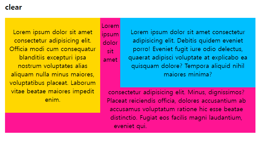
여기서 빈 공간에 글자가 들어가는 이유를 궁금해 할 수 있다. 나도 궁금했다. 위 float부분에서는 색상만 들어가고 글자는 들어가지 않았다. 하지만 여기서는 margin을 사용한 것이 아니고, 전체 body의 폭과 요소들에 width %를 사용했다. 그렇기 때문에 남은 공간으로 인식해서 들어가는 것이라고 생각한다.
clear를 사용했을 때
<!DOCTYPE html>
<html lang="en">
<head>
    <meta charset="UTF-8">
    <meta name="viewport" content="width=device-width, initial-scale=1.0">
    <title>clear</title>
    <style>
        body {
            margin: 20px 30px;
            max-width: 800px;
        }
        p {
            padding: 10px;
            text-align: center;
            font-size: 20px;
        }
        #p1 {
            float: left;
            width: 38%;
            background-color: gold;
            margin-bottom: 20px;
        }
        #p2 {
            float: right;
            width: 54%;
            background-color: deepskyblue;
        }
        #p3 {
            clear: both;
            background-color: deeppink;
        }
    </style>
</head>
<body>
    <h2>clear</h2>
    <div id="p1">
        <p>Lorem ipsum dolor sit amet consectetur adipisicing elit. Officia modi cum consequatur blanditiis excepturi ipsa nostrum voluptates alias aliquam nulla minus maiores, voluptatibus placeat. Laborum vitae beatae maiores impedit enim.</p>
    </div>
    <div id="p2">
        <p>Lorem ipsum dolor sit amet consectetur adipisicing elit. Debitis quidem eveniet porro! Eveniet fugit iure odio delectus, quaerat adipisci voluptate at explicabo ea quisquam dolore? Tempora aliquid nihil maiores minima?</p>
    </div>
    <div id="p3">
        <p>Lorem ipsum dolor sit amet consectetur adipisicing elit. Minus, dignissimos? Placeat reiciendis officia, dolores accusantium ab accusamus voluptatum ratione hic esse beatae distinctio. Fugiat eos facilis magni laudantium, eveniet qui.</p>
    </div>
</body>
</html>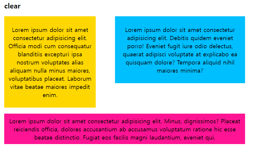
float를 사용한 레이아웃
- 2단 레이아웃(외부스타일, link 사용)
CSS 파일 코드
#container {
    width: 1000px;
    margin: 0 auto;
}
header {
    padding: 20px;
    border: 1px solid gray;
    background-color: deeppink;
    margin-bottom: 20px;
}
#contents {
    padding: 20px;
    width: 700px;
    background-color: deepskyblue;
    border: 1px solid gray;
    float: left;
}
#sidebar {
    padding: 20px;
    width: 200px;
    background-color: gold;
    border: 1px solid gray;
    float: right;
    margin-bottom: 20px;
}
#footer {
    padding: 20px;
    background-color: greenyellow;
    border: 1px solid gray;
    clear: both;
}
html 파일 코드
<!DOCTYPE html>
<html lang="en">
<head>
    <meta charset="UTF-8">
    <meta name="viewport" content="width=device-width, initial-scale=1.0">
    <title>2단레이아웃</title>
    <link rel="stylesheet" href="./css/style.css">
</head>
<body>
    <div id="container">
        <header id="header">
            <h1>사이트 제목</h1>
        </header>
        <div id="contents">
            <h2>본문</h2>
            <p>Lorem ipsum dolor sit amet consectetur adipisicing elit. Velit sapiente ut iusto! A cupiditate, quibusdam ex minima tempora voluptatibus exercitationem tempore iure necessitatibus dignissimos ab minus cum modi illo blanditiis?</p>
        </div>
        <div id="sidebar">
            <h2>사이드바</h2>
            <ul>
                <li>Lorem ipsum dolor sit amet consectetur adipisicing elit. Commodi, blanditiis rem. Maiores blanditiis quod nostrum debitis fuga, vitae iure? Ipsam deserunt alias minus corporis odit error blanditiis consequuntur quasi delectus!</li>
            </ul>
        </div>
        <footer id="footer">
            <h2>푸터</h2>
            <p>Lorem ipsum dolor sit amet consectetur adipisicing elit. Iusto neque illum magni. Iusto, ipsum aperiam. Accusantium in cupiditate maxime alias sint ut, perspiciatis eaque odio corporis perferendis, quae, quos libero!</p>
        </footer>
    </div>
</body>
</html>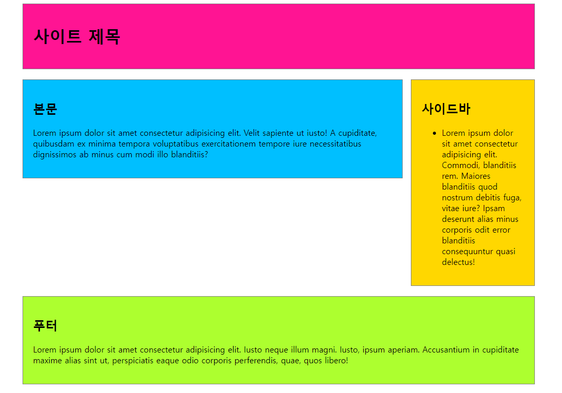
float를 사용하여 만들었고, 중요하다고 생각되는 부분은 clear를 어디에 쓰는지이다. 본문과 사이드바 밑으로 푸터를 가져오기 위해서는 footer 요소에 clear를 both속성으로 사용하면 된다.
- 3단 레이아웃(외부스타일, link사용)
CSS 파일 코드
#container {
    width: 1500px;
    margin: 0 auto;
    border: 1px solid gray;
    padding: 20px;
}
#header {
    background-color: deeppink;
    padding: 30px 20px;
    border: 1px solid gray;
    margin-bottom: 20px;
}
#contents {
    background-color: deepskyblue;
    padding: 30px 20px;
    border: 1px solid gray;
    width: 700px;
    margin-bottom: 20px;
    float: left;
}
#left-sidebar {
    background-color: gold;
    padding: 30px 20px;
    border: 1px solid gray;
    width: 300px;
    float: left;
    margin-right: 35px;
}
#right-sidebar {
    background-color: goldenrod;
    padding: 30px 20px;
    border: 1px solid gray;
    width: 300px;
    float: right;
}
#footer {
    background-color: greenyellow;
    padding: 30px 20px;
    border: 1px solid gray;
    clear: both;
}
HTML 파일 코드
<!DOCTYPE html>
<html lang="en">
<head>
    <meta charset="UTF-8">
    <meta name="viewport" content="width=device-width, initial-scale=1.0">
    <title>3단레이아웃</title>
    <link rel="stylesheet" href="./css/style1.css">
</head>
<body>
    <div id="container">
        <header id="header">
            <h1>사이트 제목</h1>
        </header>
        <div id="left-sidebar">
            <h2>사이드바</h2>
            <ul>
                <li>항목1</li>
                <li>항목2</li>
                <li>항목3</li>
                <li>항목4</li>
            </ul>
        </div>
        <div id="contents">
            <h2>본문</h2>
            <p>
                Lorem, ipsum dolor sit amet consectetur adipisicing elit. Itaque eaque quo rerum deleniti voluptas aliquid possimus necessitatibus voluptatibus suscipit voluptatem in officia omnis totam, odit, dolores ratione, nam hic eligendi.
            </p>
            <p>
                Lorem ipsum dolor sit amet consectetur adipisicing elit. Incidunt, corrupti saepe. Omnis nisi cum eveniet velit tempora quibusdam saepe voluptates mollitia, laboriosam, nostrum, neque magnam illum molestias voluptatibus nam. Aliquam.
            </p>
            <p>
                Lorem ipsum dolor sit amet consectetur adipisicing elit. Nemo deserunt aliquid, eaque ad voluptates culpa error tempora, illo repellendus exercitationem asperiores accusamus inventore libero deleniti in non, possimus earum quia.
            </p>
        </div>
        <div id="right-sidebar">
            <h2>사이드바</h2>
            <ul>
                <li>항목1</li>
                <li>항목2</li>
                <li>항목3</li>
                <li>항목4</li>
            </ul>
        </div>
        <footer id="footer">
            <h2>푸터</h2>
            <p>저작권 정보</p>
            <p>연락처 등</p>
        </footer>
    </div>
</body>
</html>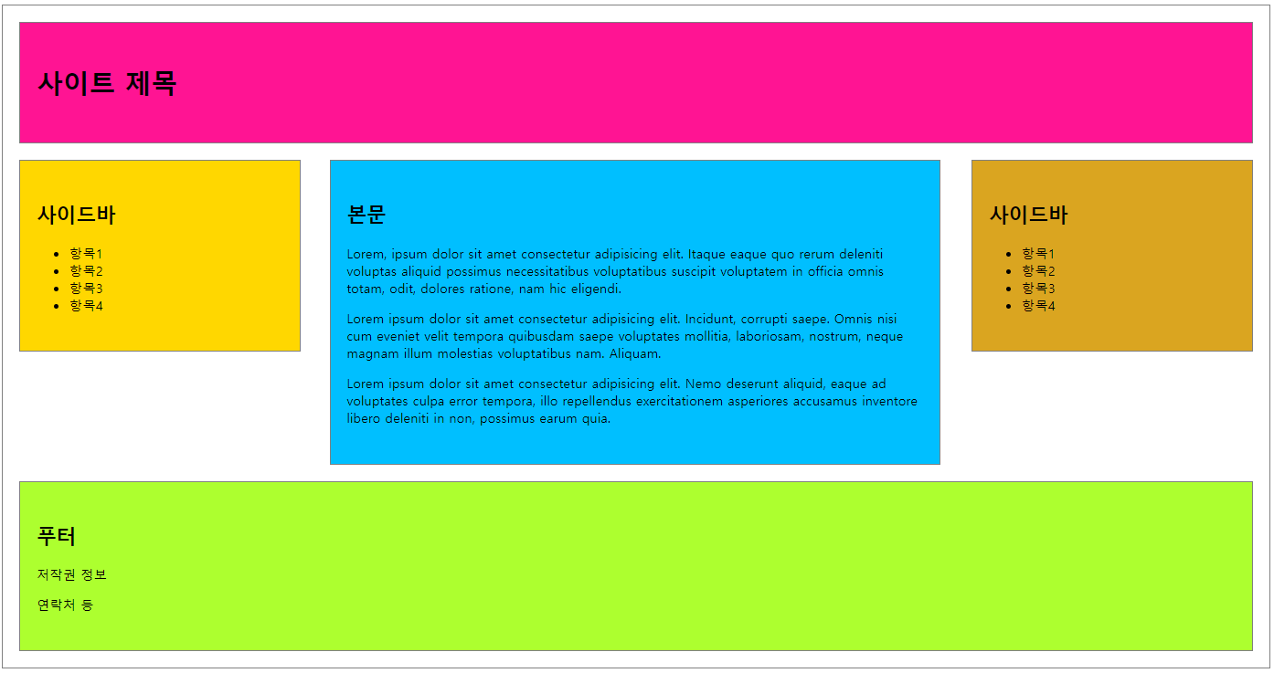
사이드바를 두 개 생성하는 레이아웃을 만들었다. 여기서 처음에 html 코드를 작성할 때 본문 - 사이드바 - 사이드바 - 푸터 순으로 작성을 했는데 막상 css코드를 사용하여 양쪽에 사이드바를 가져오게 하려니 답이 없었다.
그래서 고민하여 html 코드 순서를 사이드바 - 본문 - 사이드바 - 푸터 순으로 작성을 하게 되었고, 그 후 본문과 두 번째 사이드바를 float의 right 속성으로 보내주니 원하는 결과를 얻을 수 있었다.
하지만 사이드바 사이의 본문을 정확하게 중앙에 위치시키는 것은 힘들었다.. 눈으로 보고 맞췄다ㅜ
다단 레이아웃
- 텍스트를 column 속성으로 다단을 생성한다.
- 다단은 레이아웃을 여러 개의 컬럼으로 쪼개서 구성한다.
column-count: 단의 개수를 설정한다.
column-rule: 단과 단사이의 구분선, 구분의 모양, 두께, 색상을 설정한다.
column-gap: 단과 단사이의 여백을 설정한다.
column-span: 단과 안의 포함된 요소를 다단편집에서 해제한다.(all)
# 사용 방법
요소 {
	css 코드
    column-속성: 설정값;
}<!DOCTYPE html>
<html lang="en">
<head>
<meta charset="UTF-8">
<meta name="viewport" content="width=device-width, initial-scale=1.0">
<title>다단 레이아웃</title>
<style>
div, h2, p { margin: 0; padding: 0; }
h2 { padding: 0 0 20px; text-align: center; }
div.col {
text-align: justify;
padding: 20px;
background-color: gold;
border: 3px solid red;
column-count: 3;
column-gap: 30px;
column-rule: 3px dashed red;
}
.col > h2 {column-span: all;}
</style>
</head>
<body>
<div class="col">
<h2>다단 레이아웃</h2>
<p>Lorem ipsum, dolor sit amet consectetur adipisicing elit. Saepe, velit magni. Quisquam autem iusto, accusantium non alias perspiciatis ipsam consequuntur itaque blanditiis provident, natus repellendus perferendis sed animi quas possimus. Lorem ipsum dolor sit amet consectetur adipisicing elit. Corrupti earum magni ut vitae saepe! Reiciendis iusto architecto ratione a incidunt voluptatum nam? Dignissimos, ipsum fugit? Nemo molestias repudiandae qui consequuntur! Lorem ipsum dolor sit amet consectetur adipisicing elit. Explicabo ratione animi quam at, accusantium asperiores rerum aliquam aperiam expedita sit beatae incidunt corporis, illum sapiente accusamus quae temporibus officiis molestiae? Lorem ipsum dolor sit amet consectetur, adipisicing elit. Voluptates asperiores illo facere, corporis, ipsa iste neque reiciendis harum illum quisquam magnam doloribus aut eveniet corrupti voluptatibus veniam. Ullam, laudantium ipsa?</p>
</div>
</body>
</html>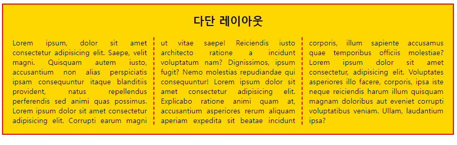
column-count 로 3칸을 나눠주고, column-gap으로 나눠준 단 사이의 여백을 설정, column-rule로 단의 나뉨을 눈으로 보여주는 점선을 생성했다.
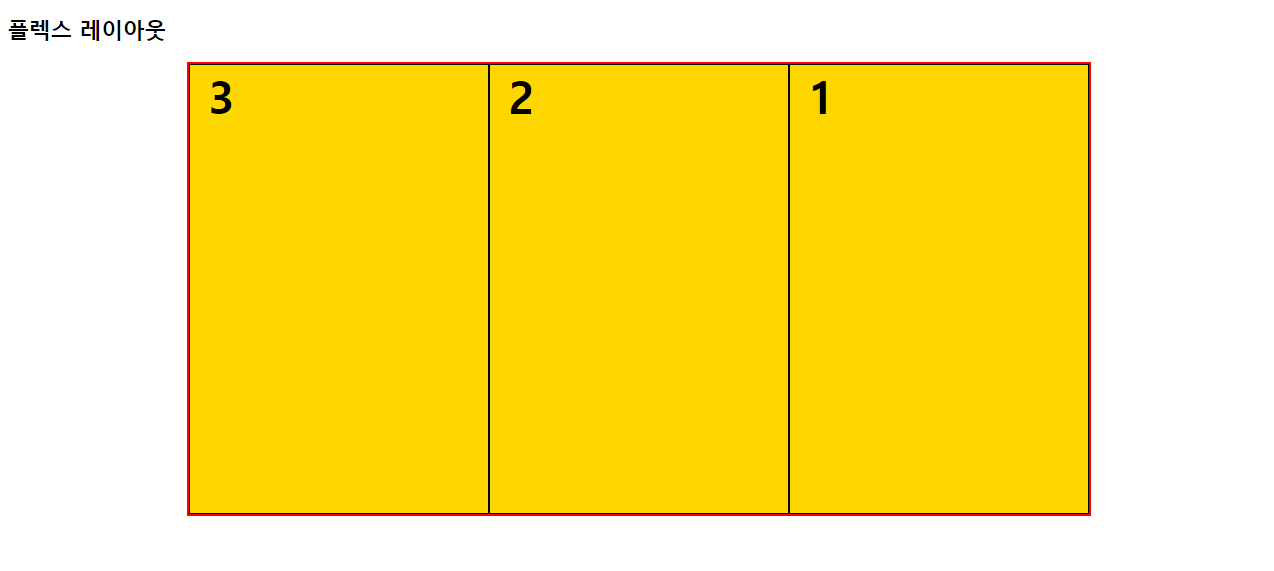
flex 레이아웃
- 수평정렬을 하기 위한 속성이다.
# 사용 방법
요소 {
	css 코드
    display: flex;
}<!DOCTYPE html>
<html lang="en">
<head>
<meta charset="UTF-8">
<meta name="viewport" content="width=device-width, initial-scale=1.0">
<title>플렉스 레이아웃</title>
<style>
#container {
width: 1000px;
height: 500px;
margin: 0 auto;
border: 3px solid red;
display: flex;
}
#container>div {
width: 400px;
border: 1px solid black;
background-color: gold;
}
span {
font-size: 50px;
font-weight: bold;
padding: 20px;
}
</style>
</head>
<body>
<h2>플렉스 레이아웃</h2>
<div id="container">
<div id="box1"><span>1</span></div>
<div id="box1"><span>2</span></div>
<div id="box1"><span>3</span></div>
</div>
</body>
</html>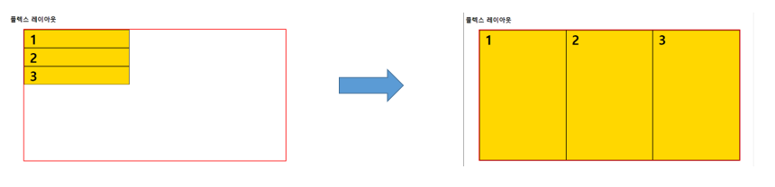
flex를 사용하면 수평으로 정렬을 해준다.
- flex-wrap
- 플렉스 라인에 여유가 없을 때 플렉스 요소의 위치를 결정하는 속성으로 nowrap이 기본값이고, 플렉스 요소가 다음줄로 넘어가지 않고 요소의 너비를 줄여 한 줄에 배치한다.
wrap: 플렉스 요소의 여유 공간이 없다면 다음줄로 넘긴다.
wrap-reverse: 플렉스 요소의 여유 공간이 없다면 다음줄로 넘긴다.(단, 아래가 아닌 위쪽으로 넘긴다.)
# 사용 방법
요소 {
	css 코드
    display: flex;		# 꼭 같이 써줘야함
    flex-wrap: 설정값;
}<!DOCTYPE html>
<html lang="en">
<head>
<meta charset="UTF-8">
<meta name="viewport" content="width=device-width, initial-scale=1.0">
<title>플렉스 레이아웃</title>
<style>
#container {
width: 1000px;
height: 500px;
margin: 0 auto;
border: 3px solid red;
display: flex;
/* 기본값 nowrap */
flex-wrap: wrap;
}
#container>div {
width: 400px;
border: 1px solid black;
background-color: gold;
}
span {
font-size: 50px;
font-weight: bold;
padding: 20px;
}
</style>
</head>
<body>
<h2>플렉스 레이아웃</h2>
<div id="container">
<div id="box1"><span>1</span></div>
<div id="box1"><span>2</span></div>
<div id="box1"><span>3</span></div>
</div>
</body>
</html>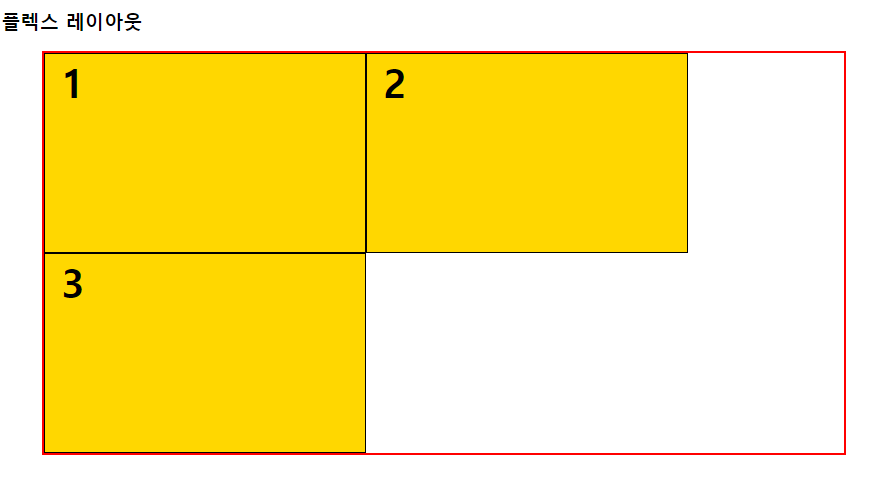
위는 속성을 wrap으로 설정한 경우 결과이다. 순서대로 1, 2, 3이 나오는데 공간이 없어서 3번이 내려간 것을 볼 수 있다.
위는 속성 wrap-reverse로 설정한 경우 결과이다. 순서가 밑에서부터 1, 2, 3이 나오고 마찬가지로 공간이 없어 3번이 올라간 것을 볼 수 있다.
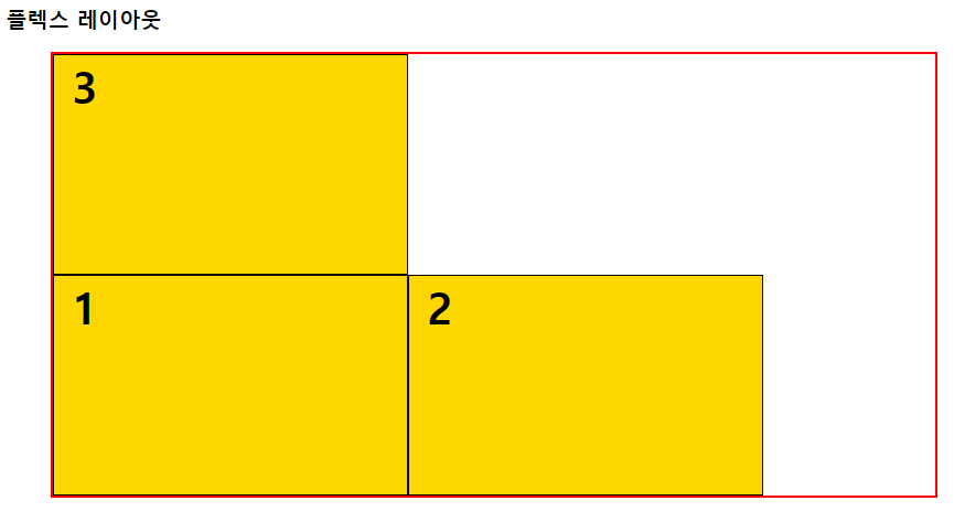
- flex-direction
- 플렉스 요소들이 배치되는 축의 방향을 결정하는 속성이다.
row: 기본값. 가로로 배치한다.
row-reverse: 가로로 배치한다.(반대)
column:세로로 배치한다.
column-reverse: 세로로 배치한다.(반대)
# 사용 방법
요소 {
	css 코드
    display: flex;
    flex-dirextionL: 설정값;
}
- row, row-reverse
<!DOCTYPE html>
<html lang="en">
<head>
    <meta charset="UTF-8">
    <meta name="viewport" content="width=device-width, initial-scale=1.0">
    <title>플렉스 레이아웃</title>
    <style>
        #container {
            width: 1000px;
            height: 500px;
            margin: 0 auto;
            border: 3px solid red;
            display: flex;
            flex-direction: row;
        }
        #container > div {
            width: 400px;
            border: 1px solid black;
            background-color: gold;
        }
        span {
            font-size: 50px;
            font-weight: bold;
            padding: 20px;
        }
    </style>
</head>
<body>
    <h2>플렉스 레이아웃</h2>
    <div id="container">
        <div id="box1"><span>1</span></div>
        <div id="box2"><span>2</span></div>
        <div id="box3"><span>3</span></div>
    </div>
</body>
</html>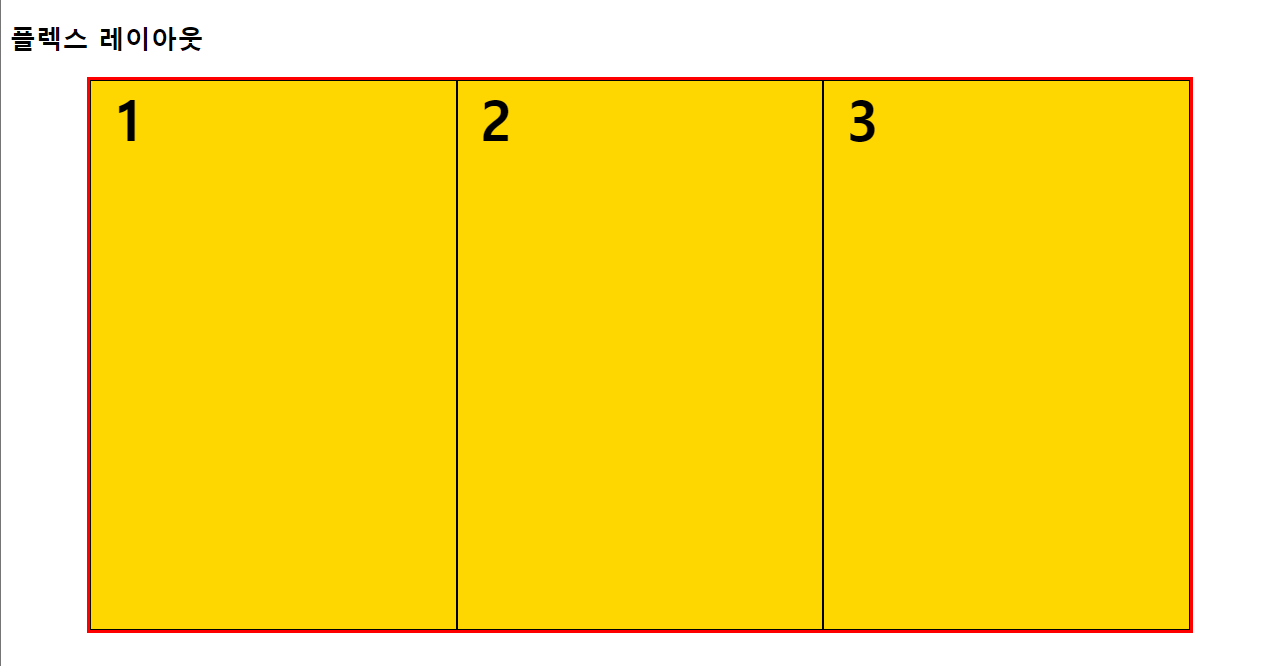
row는 가로로 배치되며 설정값을 안 넣었을 때, 기본값과 비슷하다.
row-reverse는 역순으로 배치된다.
- column, column-reverse
<!DOCTYPE html>
<html lang="en">
<head>
    <meta charset="UTF-8">
    <meta name="viewport" content="width=device-width, initial-scale=1.0">
    <title>플렉스 레이아웃</title>
    <style>
        #container {
            width: 1000px;
            height: 500px;
            margin: 0 auto;
            border: 3px solid red;
            display: flex;
            flex-direction: column;
        }
        #container > div {
            width: 400px;
            border: 1px solid black;
            background-color: gold;
        }
        span {
            font-size: 50px;
            font-weight: bold;
            padding: 20px;
        }
    </style>
</head>
<body>
    <h2>플렉스 레이아웃</h2>
    <div id="container">
        <div id="box1"><span>1</span></div>
        <div id="box2"><span>2</span></div>
        <div id="box3"><span>3</span></div>
    </div>
</body>
</html>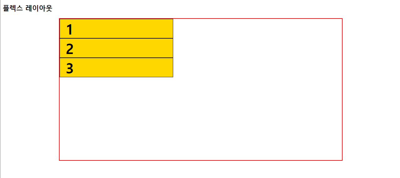
column은 세로로 배치된다.
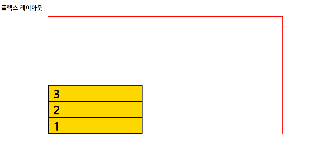
column-reverse는 세로로 배치하며, 밑에서부터 하나씩 쌓이는 느낌으로 배치된다.
- flex-flow
- flex-wrap과 flex-direction을 한꺼번에 지정할 수 있는 속성이다.
# 사용 방법
요소 {
	css 코드
    display: flex;
    flex-flow: 설정값;
}<!DOCTYPE html>
<html lang="en">
<head>
<meta charset="UTF-8">
<meta name="viewport" content="width=device-width, initial-scale=1.0">
<title>플렉스 레이아웃</title>
<style>
#container {
width: 1000px;
height: 500px;
margin: 0 auto;
border: 3px solid red;
display: flex;
flex-flow: row-reverse nowrap;
}
#container > div {
width: 400px;
border: 1px solid black;
background-color: gold;
}
span {
font-size: 50px;
font-weight: bold;
padding: 20px;
}
</style>
</head>
<body>
<h2>플렉스 레이아웃</h2>
<div id="container">
<div id="box1"><span>1</span></div>
<div id="box2"><span>2</span></div>
<div id="box3"><span>3</span></div>
</div>
</body>
</html>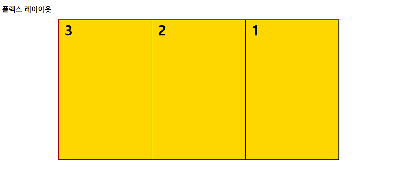
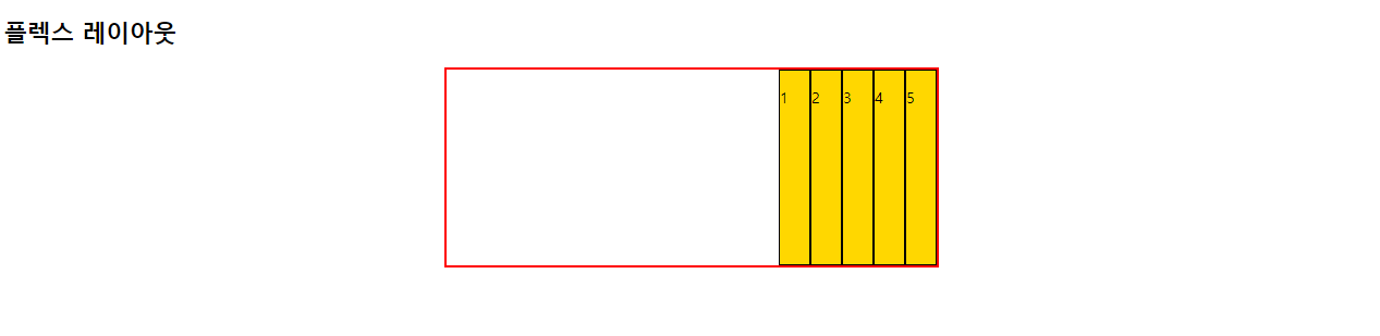
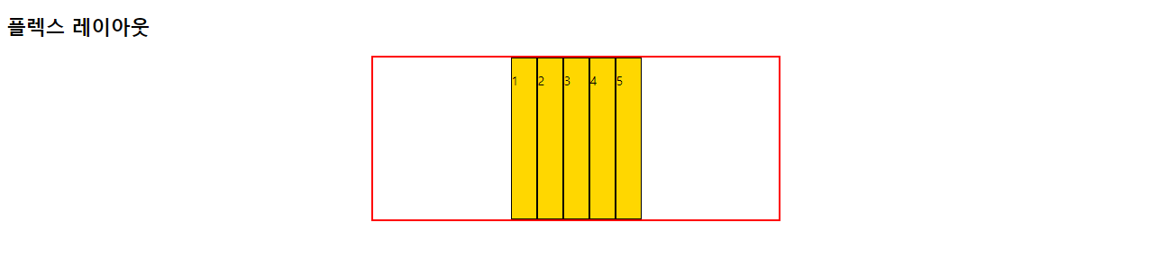
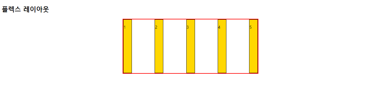
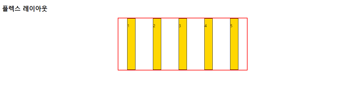
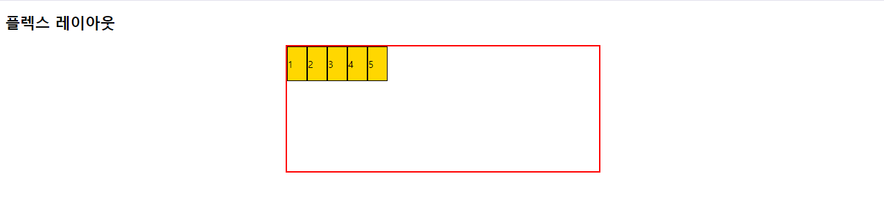
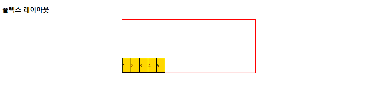
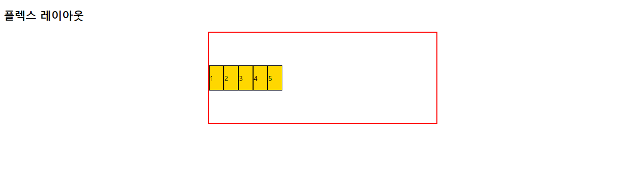
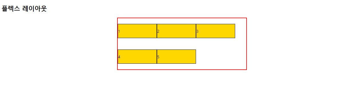
- justiry-content
- 플렉스 요소의 수평방향 정렬방식을 설정한다.
flex-start: 기본값. 앞쪽에서부터 배치한다.
flex-end: 뒤쪽에서부터 배치한다.
center: 가운데 배치한다.
space-between: 요소들 사이에 여유 공간을 두고 배치한다.(앞뒤 양쪽에 요소를 붙인다.)
space-around: 요소를 사이에 여유 공간을 두고 배치한다.(앞뒤 약간의 공간을 둔다.)
# 사용 방법
요소 {
	css 코드
    display: flex;
    justiry-cotent: 설정값;
}<!DOCTYPE html>
<html lang="en">
<head>
<meta charset="UTF-8">
<meta name="viewport" content="width=device-width, initial-scale=1.0">
<title>플렉스 에이아웃</title>
<style>
.wrapper {
width: 500px;
height: 200px;
margin: 0 auto;
border: 3px solid red;
}
.wrapper div {
width: 500px;
border: 2px solid black;
background-color: gold;
}
#container {
display: flex;
justify-content: flex-start;
}
</style>
</head>
<body>
<h2>플렉스 에이아웃</h2>
<div id="container" class="wrapper">
<div id="box1">
<p>1</p>
</div>
<div id="box2">
<p>2</p>
</div>
<div id="box3">
<p>3</p>
</div>
<div id="box4">
<p style="font-size: 50px;">4</p>
</div>
<div id="box5">
<p>5</p>
</div>
</div>
</body>
</html>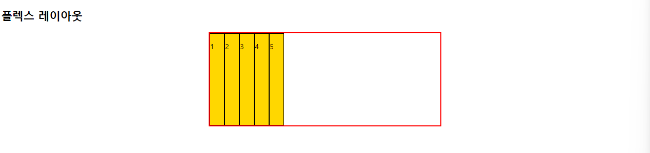
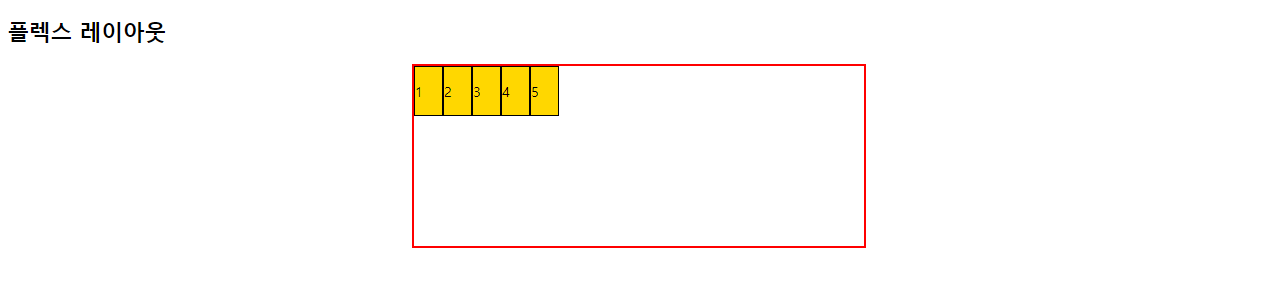
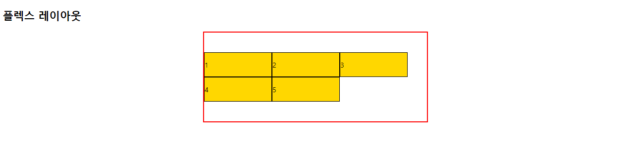
- align-items
- 플렉스 요소의 수직방향 정렬방식을 설정한다.
stretch: 기본값. 아이템들이 수직축 방향으로 늘어남
flex-start: 요소들이 시작점으로 정렬
flex-end: 요소들이 끝으로 정렬
center: 요소들이 가운데로 정렬
baseline: 요소들이 텍스트 베이스라인 기준으로 정렬
# 사용 방법
요소 {
	css 코드
    diaplay: flex;
    align-items: 설정값;
}<!DOCTYPE html>
<html lang="en">
<head>
<meta charset="UTF-8">
<meta name="viewport" content="width=device-width, initial-scale=1.0">
<title>플렉스 레이아웃</title>
<style>
.wrapper {
width: 500px;
height: 200px;
margin: 0 auto;
border: 3px solid red;
}
.wrapper div {
width: 30px;
background-color: gold;
border: 1px solid black;
}
#container {
display: flex;
align-items: stretch;
}
</style>
</head>
<body>
<h2>플렉스 레이아웃</h2>
<div id="container" class="wrapper">
<div id="box1">
<p>1</p>
</div>
<div id="box2">
<p>2</p>
</div>
<div id="box3">
<p>3</p>
</div>
<div id="box4">
<p>4</p>
</div>
<div id="box5">
<p>5</p>
</div>
</div>
</body>
</html>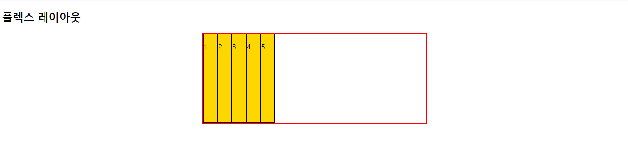
baseline은 숫자들에 밑줄을 그었을 때, 그 밑줄을 기준으로 정렬하는 것이다.
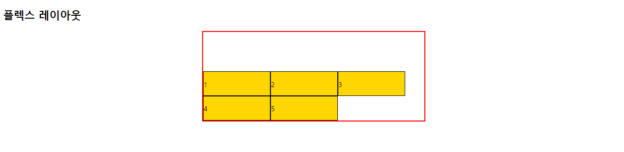
- align-self
- 플렉스 요소에 수직축으로 다른 align 속성값을 설정한다.
# 사용 방법
요소 {
	css 코드
    display: flex;
    요소 { align-self: 설정값; }
}<!DOCTYPE html>
<html lang="en">
<head>
<meta charset="UTF-8">
<meta name="viewport" content="width=device-width, initial-scale=1.0">
<title>플렉스 레이아웃</title>
<style>
.wrapper {
width: 500px;
height: 200px;
margin: 0 auto;
border: 3px solid red;
}
.wrapper div {
width: 30px;
background-color: gold;
border: 1px solid black;
}
#container {
display: flex;
align-items: baseline;
}
#box2 { align-self: center;}
</style>
</head>
<body>
<h2>플렉스 레이아웃</h2>
<div id="container" class="wrapper">
<div id="box1">
<p>1</p>
</div>
<div id="box2">
<p>2</p>
</div>
<div id="box3">
<p>3</p>
</div>
<div id="box4">
<p>4</p>
</div>
<div id="box5">
<p>5</p>
</div>
</div>
</body>
</html>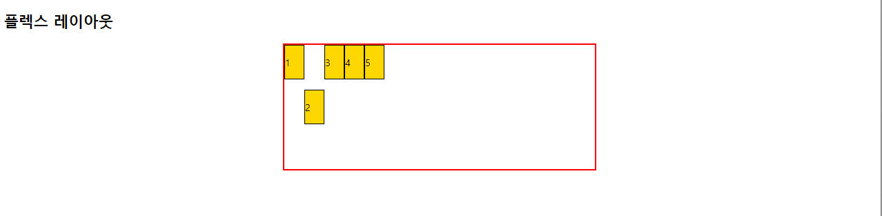
box2 만 center 속성으로 가운데 배치했다.
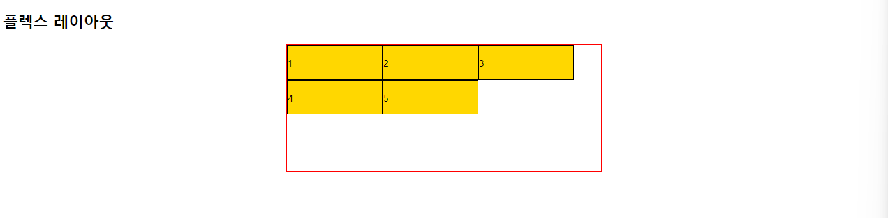
- order
- 플렉스 요소의 시각적 순서를 설정한다.
# 사용 방법
요소 {
	css 코드
    display: flex;
    요소 { order: 숫자; }
    요소 { order: 숫자; }
    요소 { order: 숫자; }
}<!DOCTYPE html>
<html lang="en">
<head>
<meta charset="UTF-8">
<meta name="viewport" content="width=device-width, initial-scale=1.0">
<title>플렉스 레이아웃</title>
<style>
.wrapper {
width: 500px;
height: 200px;
margin: 0 auto;
border: 3px solid red;
}
.wrapper div {
width: 30px;
background-color: gold;
border: 1px solid black;
}
#container {
display: flex;
align-items: baseline;
}
#box2 { align-self: center;}
#box1 { order: 4; }
#box2 { order: 1; }
#box3 { order: 5; }
#box4 { order: 2; }
#box5 { order: 3; }
</style>
</head>
<body>
<h2>플렉스 레이아웃</h2>
<div id="container" class="wrapper">
<div id="box1">
<p>1</p>
</div>
<div id="box2">
<p>2</p>
</div>
<div id="box3">
<p>3</p>
</div>
<div id="box4">
<p>4</p>
</div>
<div id="box5">
<p>5</p>
</div>
</div>
</body>
</html>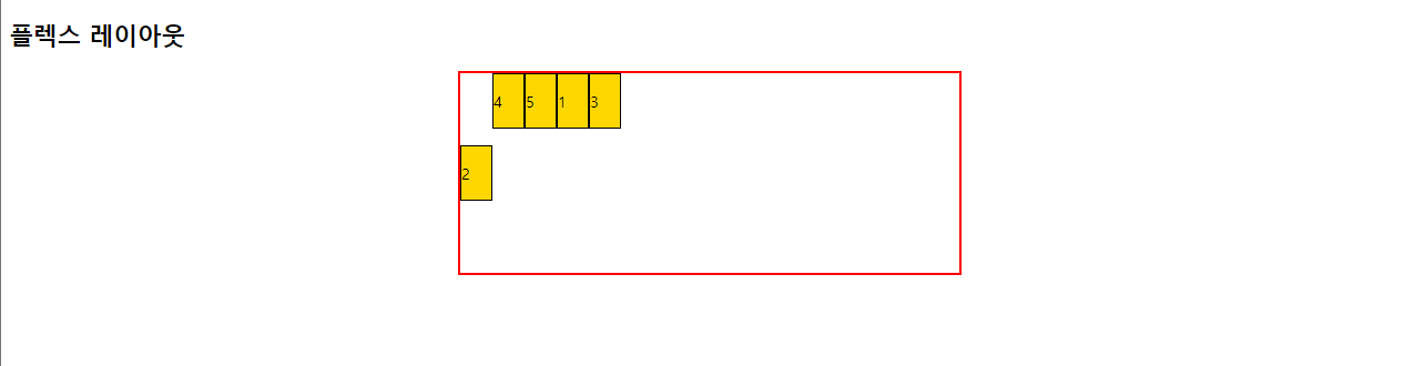
순서가 바뀐 것을 알 수 있다.
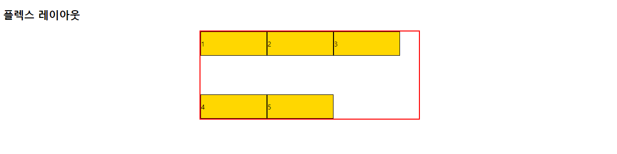
- align-content
- 플렉스 요소가 설정된 상태에서 요소들이 2줄 이상 되었을 때 수직방향 정렬방식을 설정한다. (단, flex-wrap의 값을 wrap으로 설정해야 한다.)
stretch: 기본값. 아이템들이 수직축 방향으로 늘어난다.
flex-start: 요소들이 시작점으로 정렬한다.
flex-end: 요소들이 끝으로 정렬한다.
center: 요소들이 가운데로 정렬한다.
space-between: 요소들 사이에 여유 공간을 두고 배치한다.(앞뒤 양쪽에 요소를 붙인다.)
space-around: 요소를 사이에 여유 공간을 두고 배치한다.(앞뒤 약간의 공간을 둔다.)
# 사용 방법
요소 {
	css 코드
    display: flex;
    flex-wrap: wrap;
    align-content: 설정값;
}<!DOCTYPE html>
<html lang="en">
<head>
<meta charset="UTF-8">
<meta name="viewport" content="width=device-width, initial-scale=1.0">
<title>플렉스 레이아웃</title>
<style>
.wrapper {
width: 500px;
height: 200px;
margin: 0 auto;
border: 3px solid red;
}
.wrapper div {
width: 150px;
background-color: gold;
border: 1px solid black;
}
#container {
display: flex;
flex-wrap: wrap;
align-content: stretch;
}
</style>
</head>
<body>
<h2>플렉스 레이아웃</h2>
<div id="container" class="wrapper">
<div id="box1">
<p>1</p>
</div>
<div id="box2">
<p>2</p>
</div>
<div id="box3">
<p>3</p>
</div>
<div id="box4">
<p>4</p>
</div>
<div id="box5">
<p>5</p>
</div>
</div>
</body>
</html>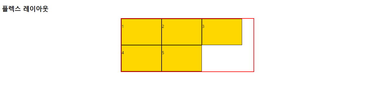
미디어 쿼리(media query)
- 반응형 웹
하나의 웹사이트에서 pc, 스마트폰, 태블릿 등 접속하는 디스플레이 종류에 따라 화면의 크기가 자동으로 변하도록 만든 웹페이지 접근방식이다.
# 사용 방법
@media 매체유형 and (속성에 대한 조건) {
    css코드 ...
}<!DOCTYPE html>
<html lang="en">
<head>
<meta charset="UTF-8">
<meta name="viewport" content="width=device-width, initial-scale=1.0">
<title>미디어 쿼리1</title>
<style>
body { background-color: blueviolet; }
@media screen and (min-width: 800px) {
body {background-color: deepskyblue; }
}
</style>
</head>
<body>
<h2>미디어 쿼리1</h2>
</body>
</html>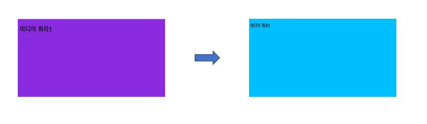
웹페이지 넓이가 800px을 넘어가면 색이 바뀌는 것을 알 수 있다.
- 매체 유형
all : 모든 매체
screen : 컴퓨터, 태블릿, 스마트폰 ..
print : 프린터
speech : 스크린 리더
- em
- 부모 요소 크기의 몇 배 인지를 단위로 설정한다.
- pc의 일반 텍스트 크기 : 16px = 1em
- 모바일의 일반 텍스트 크기 : 12px = 1em
- rem
- 문서의 최상위 요소(html)의 몇 배 인지를 크기로 설정한다.
- pc의 일반 텍스트 크기 : 16px = 1 rem
- 모바일의 일반 텍스트 크기 : 12px = 1 rem
- 크기에 따라 변화되는 웹페이지 만들기
CSS 파일 코드
* {
    margin: 0;
    padding: 0;
    box-sizing: border-box;
}

header {
    width: 100%;
    background-color: black;
    margin-bottom: 20px;
}

nav > ul {
    height: 50px;
    list-style: none;
    color: gold;
    font-size: 12px;
}

nav > ul > li {
    float: left;
    padding: 10px;
    margin: 5px 5px;
}

/*
    구형폰: 320px;
    일반폰: 360px ~
*/

nav, #contents {
    width: 320px;
    margin: 0 auto;
}

#intro > img {
    width: 100%;
    padding: 10px;
}

#desc {
    width: 100%;
    padding: 10px;
    line-height: 1.5;
}

footer {
    width: 100%;
    height: 50px;
    padding: 10px;
    background-color: black;
    color: white;
}

footer > p {
    text-align: center;
    font-size: 16px;
    line-height: 25px;
}

/* 태블릿: 768px ~ */
@media screen and ( min-width: 768px ) {
    nav > ul {
        font-size: 20px;
        height: 80px;
    }

    nav > ul > li {
        margin: 20px 25px;
    }

    nav, #contents {
        width: 750px;
        margin: 0 auto;
    }

    #intro {
        width: 100%;
    }

    #intro > img {
        width: 22%;
        padding: 10px;
    }

    #desc {
        width: 100%;
        padding: 10px;
        margin: 10px auto;
    }

    footer {
        height: 70px;
        padding: 10px;
    }

    footer > p {
        font-size: 20px;
        line-height: 50px;
    }
}

/* 데스크탑: 1024px ~ */
@media screen and (min-width: 1024px) {
    nav, #contents {
        width: 1000px;
        margin: 0 auto;
    }

    #intro > img {
        width: 10%;
        padding: 10px;
        float: left;
        margin-right: 20px;
    }

    #desc {
        height: auto;
        font-size: 20px;
        padding: 10px;
    }

    footer {
        clear: both;
    }
}
HTML 파일 코드
<!DOCTYPE html>
<html lang="en">
<head>
    <meta charset="UTF-8">
    <meta name="viewport" content="width=device-width, initial-scale=1.0">
    <title>미디어 쿼리2</title>
    <link rel="stylesheet" href="./css/media.css">
</head>
<body>
    <div id="container">
        <header>
            <nav>
                <ul>
                    <li>인스타그램</li>
                    <li>유튜브</li>
                    <li>페이스북</li>
                    <li>트위터</li>
                </ul>
            </nav>
        </header>
        <div id="contents">
            <section id="intro">
                <img src="./images/facebook.png" alt="페이스북">
                <img src="./images/youtube.png" alt="유튜브">
                <img src="./images/instagram.png" alt="인스타그램">
                <img src="./images/twitter.png" alt="트위터">
            </section>
            <section id="desc" class="text">
                <p>Lorem ipsum dolor sit amet consectetur adipisicing elit. Quibusdam eligendi, expedita, sint a dolorum doloremque maiores similique vitae aut natus facere debitis ad earum. Perspiciatis quia distinctio minima velit optio.Lorem ipsum dolor sit amet consectetur adipisicing elit. Quibusdam eligendi, expedita, sint a dolorum doloremque maiores similique vitae aut natus facere debitis ad earum. Perspiciatis quia distinctio minima velit optio.Lorem ipsum dolor sit amet consectetur adipisicing elit. Quibusdam eligendi, expedita, sint a dolorum doloremque maiores similique vitae aut natus facere debitis ad earum. Perspiciatis quia distinctio minima velit optio.</p>
            </section>
        </div>
        <footer>
            <p>copyright 2024 by 적당한 일상</p>
        </footer>
    </div>
</body>
</html>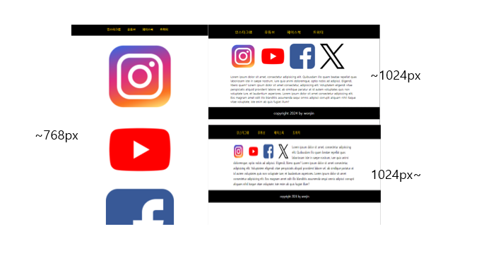
CSS 파일 코드
#container {
    width: 100;
}

header {
    width: 100%;
}

header > h1 {
    text-align: center;
    font-size: 3em;
}

#menus {
    width: 100%;
}

#menus > div {
    height: 400px;
    border: 1px solid black;
    margin-bottom: 15px;
    position: relative;
}

#menus h2 {
    position: absolute;
    right: 3%;
    bottom: 10px;
    font-size: 2em;
    color: white;
    text-shadow: 3px 3px 5px black;
}

#menu1, #menu2, #menu3, #menu4, #menu5 {
    width: 100%;
}

#menu1 {
    background: url(../images/dish1.jpg) no-repeat center/cover;
}

#menu2 {
    background: url(../images/dish2.jpg) no-repeat center/cover;
}

#menu3 {
    background: url(../images/dish3.jpg) no-repeat center/cover;
}

#menu4 {
    background: url(../images/dish4.jpg) no-repeat center/cover;
}

#menu5 {
    background: url(../images/dish5.jpg) no-repeat center/cover;
}

footer {
    width: 100%;
    background-color: black;
    height: 100px;
}

footer > p {
    font-size: 1.5em;
    color: white;
    text-align: center;
    line-height: 100px;
}

@media screen and (min-width: 768px) {
    #menus {
        display: flex;
        flex-wrap: wrap;
        justify-content: space-between;
    }

    #menu1, #menu2, #menu3, #menu4, #menu5 {
        width: 49%;
    }
}

@media screen and (min-width: 1024px) {
    #menu1, #menu2, #menu3, #menu4 {
        width: 32%;
    }

    #menu5 {
        width: 66%;
    }
}
HTML 파일 코드
<!DOCTYPE html>
<html lang="en">
<head>
    <meta charset="UTF-8">
    <meta name="viewport" content="width=device-width, initial-scale=1.0">
    <title>솔로의 식탁</title>
    <link rel="stylesheet" href="./css/solo.css">
</head>
<body>
    <div id="container">
        <header>
            <h1>솔로의 식탁</h1>
        </header>
        <section id="menus">
            <div id="menu1">
                <h2>밥/죽</h2>
            </div>
            <div id="menu2">
                <h2>샐러드</h2>
            </div>
            <div id="menu3">
                <h2>반찬</h2>
            </div>
            <div id="menu4">
                <h2>토스트</h2>
            </div>
            <div id="menu5">
                <h2>음료/칵테일</h2>
            </div>
        </section>
        <footer>
            <p>솔로의 식탁</p>
        </footer>
    </div>
</body>
</html>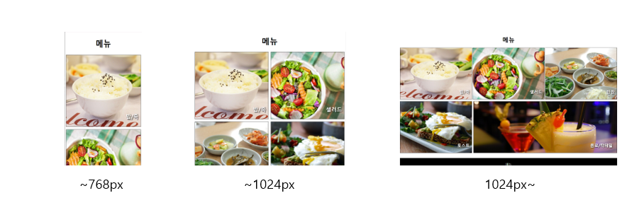
'Web > css' 카테고리의 다른 글
| CSS 우선순위, Custom properties, 2D, Animation (0) | 2024.04.13 |
|---|---|
| CSS 배경, 디스플레이, 폼, 위치 (0) | 2024.04.10 |
| CSS(Cascading Style Sheets) (1) | 2024.04.10 |