CSS 문법
- HTML 문서 <head> 요소 안에 <style> 요소를 사용하여 CSS 문법을 적용
# 문법 적용 방법

선택자 { 속성명:속성값; 속성명:속성값; ...}
p { text-align:center; color:blue;}
---                    ----- ----
선택자                  속성  속성값
CSS를 적용하는 방법
- 인라인 스타일
HTML 요소 내부에 style 속성을 사용하여 적용하는 방법
# 예시
<p style='text-align:center; color:blue;'>안녕하세요</p><!DOCTYPE html>
<html lang="en">
<head>
<meta charset="UTF-8">
<meta name="viewport" content="width=device-width, initial-scale=1.0">
<title>인라인 스타일</title>
</head>
<body>
<h2 style="text-align: center; font-size: 50px;">인라인 스타일</h2> # <요소 style="속성:값;">
<p style="text-align: center; font-size: 20px; color: deepskyblue">HTML 요소 내부에 style 속성을 사용하여 적용하는 방법</p>
</body>
</html>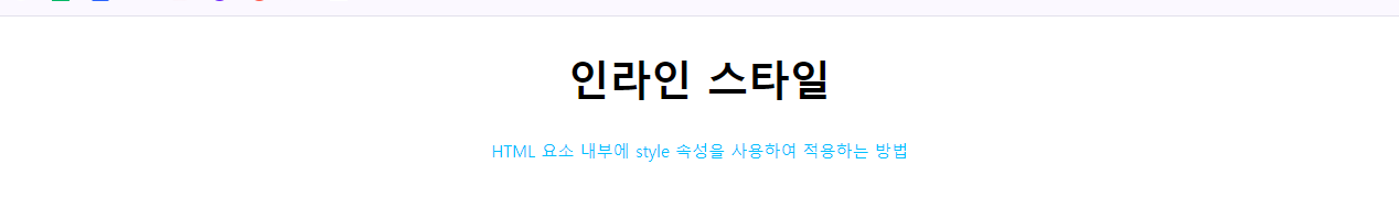
인라인 스타일은 요소 내부에 style 속성을 사용하여 지정하는 방식이다.
이 방법은 다른 스타일보다 우선순위가 높다. 하지만 유지 보수가 어려워 잘 사용하지 않는다.
- 내부 스타일
HTML 문서의 <head> ~ </head> 사이에 <style> ~ </style> 요소를 사용하여 적용하는 방법
# 예시
<head>
    <style>
        p{text-align:center; color:blue;}
    </style>
</head><!DOCTYPE html>
<html lang="en">
<head>
<meta charset="UTF-8">
<meta name="viewport" content="width=device-width, initial-scale=1.0">
<title>내부 스타일</title>
<style>
h2 { font-size: 50px } # {속성명:속성값;}
ul { list-style: none; }
li { display: inline-block; margin-right: 50px; font-weight: bold; color: deeppink;}
</style>
</head>
<body>
<h2>CSS를 적용하는 방법</h2>
<ul>
<li>인라인 스타일</li>
<li>내부 스타일</li>
<li>외부 스타일</li>
</ul>
</body>
</html>
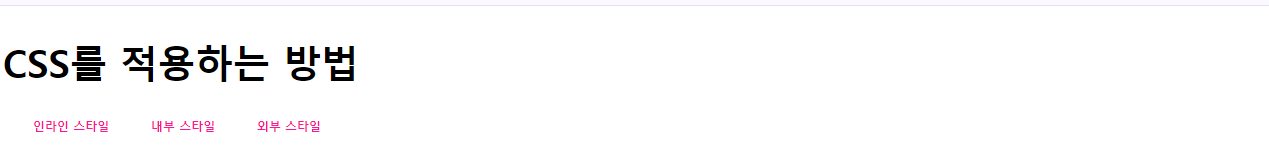
내부 스타일은 HTML 문서 내부에 <style> 태그를 사용하여 지정하는 방식이다.
이 방법은 인라인 스타일보다 우선순위가 낮고, 외부스타일과는 적용한 순서에 따라 나중에 적용한 것이 우선된다.
- 외부 스타일
웹 사이트 전체의 스타일을 하나의 파일에서 변경할 수 있도록 적용하는 방법
# 예시
<head>
    <link rel='stylesheet' href='css 파일경로'>
</head>

# rel
# 현재 문서와 링크된 무서 사이의 연관관계를 명시<!DOCTYPE html>
<html lang="en">
<head>
<meta charset="UTF-8">
<meta name="viewport" content="width=device-width, initial-scale=1.0">
<title>외부 스타일</title>
<link rel="stylesheet" href="css/style.css"> # link 태그를 사용하여 style.css 파일 로드
</head>
<body>
<h2>CSS를 적용하는 방법</h2>
<ul>
<li>인라인 스타일</li>
<li>내부 스타일</li>
<li>외부 스타일</li>
</body>
</html>
# 별개 파일 코드
# css 파일 내부에 style.css
h2 { font-size: 50px } /* h2 요소를 50px로 설정 */
ul { list-style: none; }
li { display: inline-block; margin-right: 50px; font-weight: bold; color: deeppink;}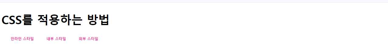
외부 스타일은 다른 파일에서 스타일을 지정하는 방법이다.
이 방법은 인라인 스타일보다 우선순위가 낮고 내부 스타일과는 적용한 순서에 따라 나중에 적용한 것이 우선된다. 별개의 파일을 사용하여 작성하기 때문에 유지보수가 좋고, 여러 HTML문서에 사용할 수 있다.
주석문
CSS 주석문은 /* ~ */ 사이에 내용을 입력하면 된다.
선택자
- 전체 선택자
- 스타일을 모든 요소에 적용하며, * 기호를 사용하여 표현한다.
- 너무 많은 요소가 있는 HTML 문서에 사용할 경우 부하를 줄 수 있다.
- 개별적으로 적용한 스타일은 전체 선택자에 적용한 스타일보다 우선순위가 높다.
# 사용 방법
* { 속성명1: 속성값; 속성명2: 속성값; ... }<!DOCTYPE html>
<html lang="en">
<head>
<meta charset="UTF-8">
<meta name="viewport" content="width=device-width, initial-scale=1.0">
<title>전체 선택자</title>
<style>
h2 { color: deeppink; font-size: 50px; }
* { color: deepskyblue; } # 전체 선택자, 모든 요소에 적용
</style>
</head>
<body>
<h2>전체 선택자</h2>
<ol>
<li>스타일을 모든 요소에 적용</li>
<li>* 기호를 사용하여 표현</li>
<li>너무 많은 요소가 있는 HTML 문서에 사용할 경우 부하를 줄 수 있음</li>
</ol>
</body>
</html>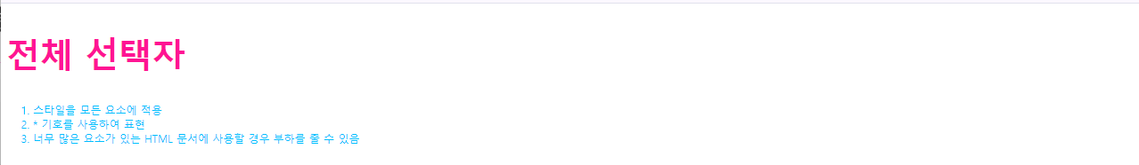
- 요소 선택자
- 특정 요소가 쓰인 모든 요소에 스타일을 적용한다.
- 전체 선택자보다 우선순위가 높다.
# 사용 방법
요소 {속성명:속성값; 속성명:속성값; ..}<!DOCTYPE html>
<html lang="en">
<head>
<meta charset="UTF-8">
<meta name="viewport" content="width=device-width, initial-scale=1.0">
<title>요소 선택자</title>
<style>
h2 { font-size: 50px; } # 요소 {속성명:속성값;}
p { color: deepskyblue;}
</style>
</head>
<body>
<h2>요소 선택자</h2>
<p>특정 요소가 쓰인 모든 요소에 스타일을 적용</p>
<p><span>span 요소</span></p>
<p><strong>strong 요소</strong></p>
<p><ins>ins 요소</ins></p>
</body>
</html>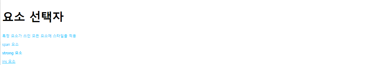
- id 선택자
- - 웹 문서 안의 특정 부분 스타일을 적용하며, # 기호를 사용하여 id 속성을 가진 요소에 스타일을 적용한다.
# 사용 방법 예시
[HTML]
<h2 id='hello'>안녕하세요</h2>
<h2>반갑습니다.</h2>

[CSS]
h2 { font-size: 30px; } /* "안녕하세요", "반갑습니다" 모두 글자 크기를 30px로 적용 */
h2#hello { font-size: 20px; } /* "안녕하세요" 글자 크기를 20px로 적용 */
#hello { color: pink; } /* "안녕하세요" 글자 색상 pink로 적용 */<!DOCTYPE html>
<html lang="en">
<head>
<meta charset="UTF-8">
<meta name="viewport" content="width=device-width, initial-scale=1.0">
<title>id 선택자</title>
<style>
#container {
background-color: gold;
padding: 20px; /* 안쪽 여백 */
width: 200px;
height: 100px;
text-align: center;
line-height: 100px;
}
#header {
background-color: deepskyblue;
width: 200px;
height: 200px;
margin: 50px auto; /* 바깥쪽 여백, 1개를 적으면 4방면 두개를 적으면 앞에는 위아래, 뒤에는 왼쪽오른쪽 적용*/
}
</style>
</head>
<body>
<h2>id 선택자</h2>
<div id="container">div 첫번째 영역</div>
<div id="header">div 두번째 영역</div>
</body>
</html>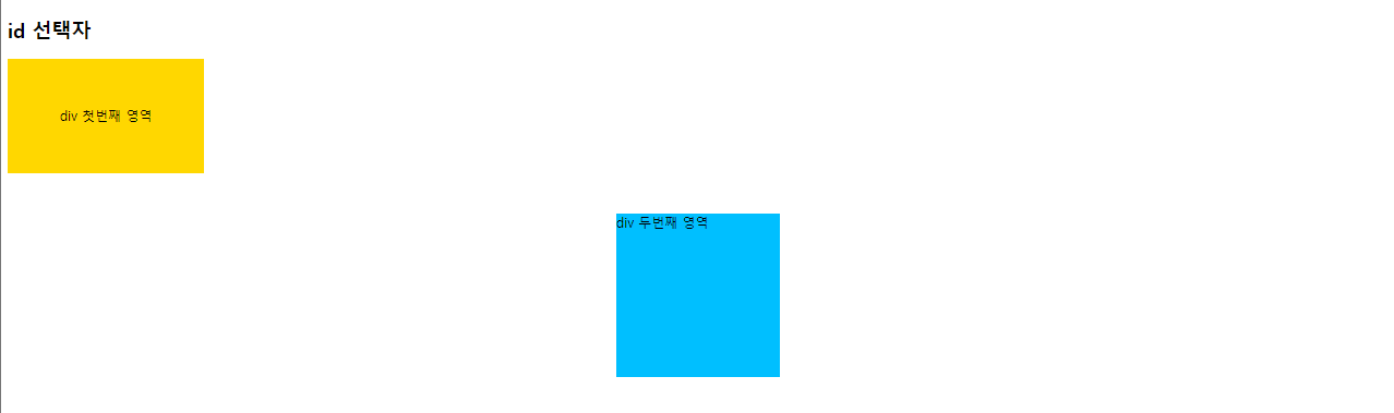
- class 선택자
- 특정 집단의 요소를 한 번에 스타일을 적용하며, .기호를 사용하여 같은 class 이름을 가진 요소에 스타일을 적용한다.
# 사용 방법 예시
[HTML]
<h2 class='hello'>안녕하세요</h2>
<h2>반갑습니다.</h2>
<p class='hello'>Hello!</p>
<p>또 만났군요</p>

[CSS]
h2 { font-size: 20px; } /* "안녕하세요", "반갑습니다" 글자 크기를 20px 적용 */
.hello { color: deeppink; } /* "안녕하세요", "hello!" 글자 색상을 deeppink로 적용 */
h2.hello { font-weight: bold; } /* "안녕하세요" 글자 두께를 bold로 적용 */<!DOCTYPE html>
<html lang="en">
<head>
<meta charset="UTF-8">
<meta name="viewport" content="width=device-width, initial-scale=1.0">
<title>class 선택자</title>
<style>
#bigText { font-size: 50px; }
.smallText { font-size: 14px; }
.redText { color: red; }
.blueText { color: blue;}
</style>
</head>
<body>
<h2 id="bigText">class 선택자</h2>
<p><span class="smallText redText">특정 집단의 요소를 한번에 스타일을 적용</span></p> <!-- 속성 두개 적용시 띄어쓰기 -->
<p><span class="smallText blueText">. 기호를 사용하여 같은 class 이음을 가진 요소에 스타일을 적용</span></p>
</body>
</html>
- 그룹 선택자
- 여러개의 선택자를 나열하여 스타일을 적용하며, 콤마(,)로 구분한다.
# 사용 방법 예시
h2, p { text-align: center; }<!DOCTYPE html>
<html lang="en">
<head>
<meta charset="UTF-8">
<meta name="viewport" content="width=device-width, initial-scale=1.0">
<title>그룹 선택자</title>
<style>
* { text-align: center; }
h2 { font-size: 50px; }
h3 { font-size: 30px; }
p, li { font-size: 20px; }
li { display: inline-block; margin-right: 40px; font-weight: bold; color: deeppink; }
</style>
</head>
<body>
<h2>그룹 선택자</h2>
<p>여러개의 선택자를 나열하여 스타일을 적용</p>
<h3>선택자의 종류</h3>
<ul>
<li>전체 선택자</li>
<li>요소 선택자</li>
<li>아이디 선택자</li>
<li>클래스 선택자</li>
<li>그룹 선택자</li>
</ul>
</body>
</html>
- 자식 선택자
- 부모의 요소 하위의 자식 요소의 스타일을 적용한다.
# 사용 방법 예시
body > p { color: deepskyblue; }<!DOCTYPE html>
<html lang="en">
<head>
<meta charset="UTF-8">
<meta name="viewport" content="width=device-width, initial-scale=1.0">
<title>자식, 자속 선택자</title>
<style>
ul > a { font-size: 30px; } # 자식 선택자
ul a { color: deeppink; }
</style>
</head>
<body>
<h2>자식, 자손 선택자</h2>
<ul>
<a href="https://www.naver.com">네이버</a>
<li><a href="https://www.google.com">구글</a></li>
<li>다음</li>
<li><a href="https://www.nate.com">네이트</a></li>
</ul>
</body>
</html>
- 자손 선택자
- 조상 요소 하위의 모든 요소의 스타일을 적용하며, 자손은 자식을 포함한다.
# 사용 방법 예시
body p { color:deepskyblue; }<!DOCTYPE html>
<html lang="en">
<head>
<meta charset="UTF-8">
<meta name="viewport" content="width=device-width, initial-scale=1.0">
<title>자식, 자속 선택자</title>
<style>
ul > a { font-size: 30px; }
ul a { color: deeppink; } # 자손 선택자
</style>
</head>
<body>
<h2>자식, 자손 선택자</h2>
<ul>
<a href="https://www.naver.com">네이버</a>
<li><a href="https://www.google.com">구글</a></li>
<li>다음</li>
<li><a href="https://www.nate.com">네이트</a></li>
</ul>
</body>
</html>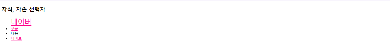
- 인접 형제 선택자
- 동일한 부모의 요소를 갖는 자식 요소들의 관계로, 연속된 동생 요소의 스타일을 적용한다.
# 사용 방법 예시
h2 + p { color: deepskyblue; }<!DOCTYPE html>
<html lang="en">
<head>
<meta charset="UTF-8">
<meta name="viewport" content="width=device-width, initial-scale=1.0">
<title>형제 선택자</title>
<style>
h3 ~ p { color: green; }
h3 + p { background-color: deeppink; } # 인접 형제 선택자
p + span { color: gold; background-color: deepskyblue; } # 인접 형제 선택자
</style>
</head>
<body>
<h2>형제 선택자</h2>
<div>
<h3>첫째</h3>
<p>둘째</p>
<a href="#">셋째</a>
<h4>넷째</h4>
<p>다섯째</p>
<span>여섯째</span>
</div>
</body>
</html>
- 일반 형제 선택자
- 형제 관계를 갖는 요소 중에서 요소 다음에 나오는 모든 동생 요소의 스타일을 적용한다.
# 사용 방법 예시
h2 ~ p { color: deeppink; }<!DOCTYPE html>
<html lang="en">
<head>
<meta charset="UTF-8">
<meta name="viewport" content="width=device-width, initial-scale=1.0">
<title>형제 선택자</title>
<style>
h3 ~ p { color: green; } # 일반 형제 선택자
h3 + p { background-color: deeppink; }
p + span { color: gold; background-color: deepskyblue; }
</style>
</head>
<body>
<h2>형제 선택자</h2>
<div>
<h3>첫째</h3>
<p>둘째</p>
<a href="#">셋째</a>
<h4>넷째</h4>
<p>다섯째</p>
<span>여섯째</span>
</div>
</body>
</html>
- 속성 선택자
- HTML 요소에서 src, href, style, type, id, class 등 속성을 선택자로 지정해서 스타일을 적용한다.
# 사용 방법 예시
[HTML]
<img src='apple.png' alt='사과 이미지'>
<img src='banana.png' alt='바나나 이미지'>

[CSS]
[src] { border: 3px solid red; }
[src='banana.png'] { border: 3px solid red; }<!DOCTYPE html>
<html lang="en">
<head>
<meta charset="UTF-8">
<meta name="viewport" content="width=device-width, initial-scale=1.0">
<title>속성 선택자</title>
<style>
[href] { text-decoration: none; color: deeppink; }
[title] { text-align: center; font-size: 50px; }
.attr { background-color: gold;}
[class="attr"] { font-size: 30px;}
</style>
</head>
<body>
<h2 title="h2 요소의 title 속성">속성 선택자</h2>
<p><a href="https://www.naver.com" target="_blank">네이버</a></p>
<p class="attr">속성명과 속성값이 모두 일치하는 요소를 선택자로 지정</p>
</body>
</html>
- 가상 선택자
- 클래스를 추가할 필요 없이 요소 중에서 순서에 따라 원하는 요소를 선택한다.
# 사용 방법 예시
[HTML]
<ul>
    <li>김사과</li>
    <li>반하나</li>
    <li>오렌지</li>
    <li>이메론</li>
</ul>

[CSS]
ul > li:first-child
ul 자식 중 li 요소 중에서 첫번째 해당하는 li 요소의 스타일을 적용

ul > li:nth-child(n)
ul 자식 중 li 요소 중에서 n번째 해당하는 li 요소의 스타일을 적용

ul > li:nth-child(even)
ul 자식 중 li 요소 중에서 짝수번째 해당하는 li 요소의 스타일을 적용

ul > li:nth-child(odd)
ul 자식 중 li 요소 중에서 홀수번째 해당하는 li 요소의 스타일을 적용

ul > li:last-child
ul 자식 중 li 요소 중에서 마지막에 해당하는 li 요소의 스타일을 적용<!DOCTYPE html>
<html lang="en">
<head>
<meta charset="UTF-8">
<meta name="viewport" content="width=device-width, initial-scale=1.0">
<title>가상 선택자</title>
<style>
.list > li:first-child { color: deeppink; }
.list > li:nth-child(2) { color: gold; }
.list > li:nth-child(odd) { background-color: greenyellow; }
.list > li:nth-child(even) { background-color: black;}
.list > li:last-child { color: white; }
</style>
</head>
<body>
<h2>가상 선택자</h2>
<ul class="list">
<li>첫번째</li>
<li>두번째</li>
<li>세번째</li>
<li>네번째</li>
</ul>
</body>
</html>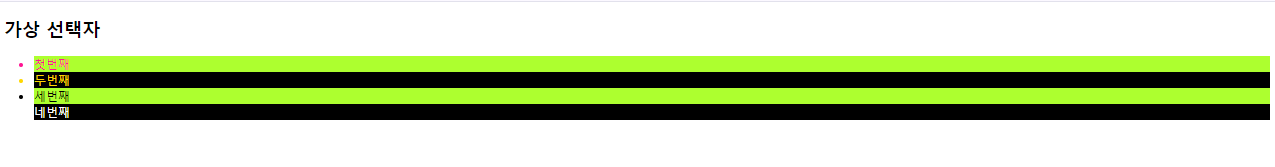
상속
- 부모 요소의 속성값이 자식 요소에게 전달되는 것이다.
# 상속 형태
<p>
    <span>
        span 요소
    </span>
</p><!DOCTYPE html>
<html lang="en">
<head>
<meta charset="UTF-8">
<meta name="viewport" content="width=device-width, initial-scale=1.0">
<title>상속</title>
<style>
div {
color: deeppink; # 상속됨
border: 3px dotted blue; # 상속안됨
}
</style>
</head>
<body>
<h2>상속</h2>
<div>
div 영역
<h3>상속이란</h3>
<p>부모 요소의 속성값이 자식 요소에게 전달되는 것</p>
</div>
</body>
</html>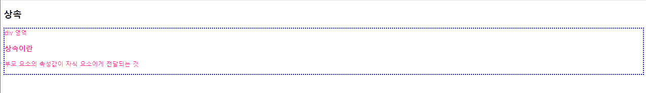
스타일링크
a:link
하이퍼링크라 연결 되었을 때 선택
a:visited
특정 하이퍼링크를 방문한 적이 있을 때 선택
a:hover
특정 요소에 마우스를 올렸을 때 선택
a:active
특정 요소에 마우스 버튼을 클릭하고 있을 때 선택<!DOCTYPE html>
<html lang="en">
<head>
<meta charset="UTF-8">
<meta name="viewport" content="width=device-width, initial-scale=1.0">
<title>스타일링 링크</title>
<style>
a:link { text-decoration: none; color: greenyellow; }
a:visited { text-decoration: none; color: deepskyblue; }
a:hover { text-decoration: underline; }
a:active { text-decoration: underline; color: red; }
</style>
</head>
<body>
<h2>스타일링 링크</h2>
<p><a href="https://python.org">파이썬 공식 사이트</a></p>
</body>
</html>
CSS 컬러
- 색상 이름으로 표현 : red, yellow, blue, black, green, white, salmon 등
- RGB(A)(Red Green Blue (Alpha, 투명도)) 색상값으로 표현 : rgb(0, 0, 225), rgba(0, 0, 225, 0.5)
CSS 텍스트
- letter-spacing : 텍스트 내에서 글자 사이의 간격을 설정한다.
- word-spacing : 텍스트 내에서 단어 사이의 간격을 설정한다.
<!DOCTYPE html>
<html lang="en">
<head>
    <meta charset="UTF-8">
    <meta name="viewport" content="width=device-width, initial-scale=1.0">
    <title>css 텍스트1</title>
    <style>
        .letter {letter-spacing: 5px; color: #3d80eb; }
        .word {word-spacing: 7px; color: rgb(222, 27, 173); }
    </style>
</head>
<body>
    <h2>css 텍스트1</h2>
    <p>letter-spacing</p>
    <p class="letter">Lorem ipsum dolor sit amet consectetur adipisicing elit. Tempore deserunt itaque enim modi. Quasi officiis, explicabo laudantium cumque accusamus suscipit incidunt, dolores consectetur fuga voluptatibus necessitatibus? Iusto tempora placeat distinctio?</p>
    <p>word-spacing</p>
    <p class="word">Lorem ipsum dolor sit amet, consectetur adipisicing elit. Assumenda placeat inventore commodi reiciendis a magni libero similique quos voluptatem nam officia molestias odio non dolorum impedit repellat ex, earum porro.</p>
</body>
</html>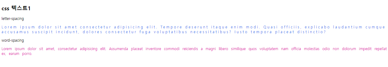
- text-align : 텍스트 수평 방향 정렬을 설정한다. (left, right, center, justify)
- text-indent : 단락의 첫 줄의 들여 쓰기를 설정한다.
- line-height : 줄 높이를 설정한다.
- 행간격 : 텍스트 행 간의 간격이 넓어짐
- 텍스트 정렬 : 수직 정렬
- 텍스트 레이아웃 : 텍스트 요소의 높이와 너비를 조절
<!DOCTYPE html>
<html lang="en">
<head>
    <meta charset="UTF-8">
    <meta name="viewport" content="width=device-width, initial-scale=1.0">
    <title>css 텍스트2</title>
    <style>
        p {border: 3px solid red; padding: 10px;}

        #align-left { text-align:left; }
        #align-right { text-align:right; }
        #align-center { text-align:center; }
        #align-justify { text-align:justify; }

        #indent1 { text-indent: 20px; }
        #indent2 { text-indent: 5%; }

        .small-line {line-height: 0.7; }
        .big-line {line-height: 3; }
        .px-line {line-height: 30px; }
        .per-line {line-height: 50%; }
    </style>
</head>
<body>
    <h2>css 텍스트2</h2>
    <p id="align-left" class="small-line">Lorem ipsum, dolor sit amet consectetur adipisicing elit. Ab, ullam facilis quas doloribus voluptatem impedit illo vitae reprehenderit. Nihil ratione aliquam consectetur hic laudantium cupiditate vel qui tempore quasi possimus!</p>
    <p id="align-right" class="big-line">Lorem ipsum, dolor sit amet consectetur adipisicing elit. Ab, ullam facilis quas doloribus voluptatem impedit illo vitae reprehenderit. Nihil ratione aliquam consectetur hic laudantium cupiditate vel qui tempore quasi possimus!</p>
    <p id="align-center" class="px-line">Lorem ipsum, dolor sit amet consectetur adipisicing elit. Ab, ullam facilis quas doloribus voluptatem impedit illo vitae reprehenderit. Nihil ratione aliquam consectetur hic laudantium cupiditate vel qui tempore quasi possimus!</p>
    <p id="align-justify" class="per-line">Lorem ipsum, dolor sit amet consectetur adipisicing elit. Ab, ullam facilis quas doloribus voluptatem impedit illo vitae reprehenderit. Nihil ratione aliquam consectetur hic laudantium cupiditate vel qui tempore quasi possimus!</p>
    <p id="align-indent1">Lorem ipsum, dolor sit amet consectetur adipisicing elit. Ab, ullam facilis quas doloribus voluptatem impedit illo vitae reprehenderit. Nihil ratione aliquam consectetur hic laudantium cupiditate vel qui tempore quasi possimus!</p>
    <p id="align-indent2">Lorem ipsum, dolor sit amet consectetur adipisicing elit. Ab, ullam facilis quas doloribus voluptatem impedit illo vitae reprehenderit. Nihil ratione aliquam consectetur hic laudantium cupiditate vel qui tempore quasi possimus!</p>
</body>
</html>
- text-decoration : 텍스트에 효과를 설정하거나 제거하는 데 사용한다. (none, underline, line-through, overline)
- font-variant : 소문자를 작은 대문자로 변경한다. (small-caps)
<!DOCTYPE html>
<html lang="en">
<head>
    <meta charset="UTF-8">
    <meta name="viewport" content="width=device-width, initial-scale=1.0">
    <title>css 텍스트3</title>
    <style>
        .variant { font-variant: small-caps; }
        .under { text-decoration: underline; }
        .through { text-decoration: line-through; }

        a:link { text-decoration: none; }
        a:visited { text-decoration: none; }
        a:hover { text-decoration: underline; }
        a:active { text-decoration: underline; }
    </style>
</head>
<body>
    <h2>HTML(<span class="variant">Hyper Text Markup Language</span>)</h2>

    <p>웹사이트의 모습을 기술하기 위한 마크업 언어.</p>

    <p><span class="under">프로그래밍 언어가 아니라 마크업 정보를 표현하는 마크업 언어로[1] 문서의 내용 이외의 문서의 구조나 서식 같은 것을 포함한다.</span> 보면 알겠지만 애초에 이름 HTML의 ML이 마크업 언어라는 뜻이다. 웹사이트에서 흔히 볼 수 있는 htm이나 html 확장자가 바로 이 언어로 작성된 문서다.</p>

    <p>최초 제안자는 CERN의 물리학자 티머시 J. 버너스리이다. URL, HTTP, WWW의 전신인 Enquire 등도 그가 세트로 개발하고 제안했다. TCP/IP 통신규약을 만든 빈턴 G. 서프(Vinton Gray Cerf)와 함께 인터넷의 아버지로 불린다.</p>

    <p><span class="through">나무위키에서는 아래와 같이 내용을 집어넣어 HTML을 적용시킬 수 있지만 도움말은 권장하지 않는 문법이고, 지원 종료 가능성이 있는 문법이므로 나무위키에서는 HTML 태그를 사용하지 않는 것을 추천한다.</span></p>

    <p><a href="https://namu.wiki/w/HTML">출처: 나무위키</a></p>
</body>
</html>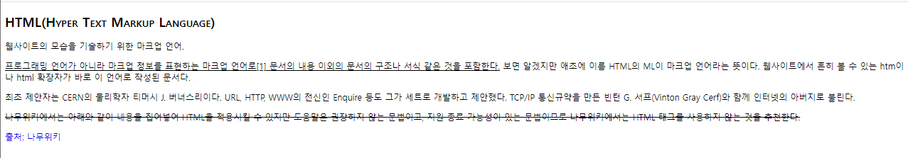
- text-shadow : 텍스트에 그림자 효과를 설정한다.
<!DOCTYPE html>
<html lang="en">
<head>
    <meta charset="UTF-8">
    <meta name="viewport" content="width=device-width, initial-scale=1.0">
    <title>css 텍스트4</title>
    <style>
        h1 { font-size: 100px; }
        .shadow1 { text-shadow: 10px 10px; }
        .shadow2 { text-shadow: 10px 10px 5px; }
        .shadow3 { text-shadow: 10px 10px 5px red; }
        .shadow4 { color: #fff; text-shadow: 10px -10px 5px #000;}
        .shadow5 { color: #fff; text-shadow: 0px 0px 8px #000;}
    </style>
</head>
<body>
    <h2>css 텍스트4</h2>
    <h1 class="shadow1">CSS Text-Shadow 속성1</h1>
    <h1 class="shadow2">CSS Text-Shadow 속성2</h1>
    <h1 class="shadow3">CSS Text-Shadow 속성3</h1>
    <h1 class="shadow4">CSS Text-Shadow 속성4</h1>
    <h1 class="shadow5">CSS Text-Shadow 속성5</h1>
</body>
</html>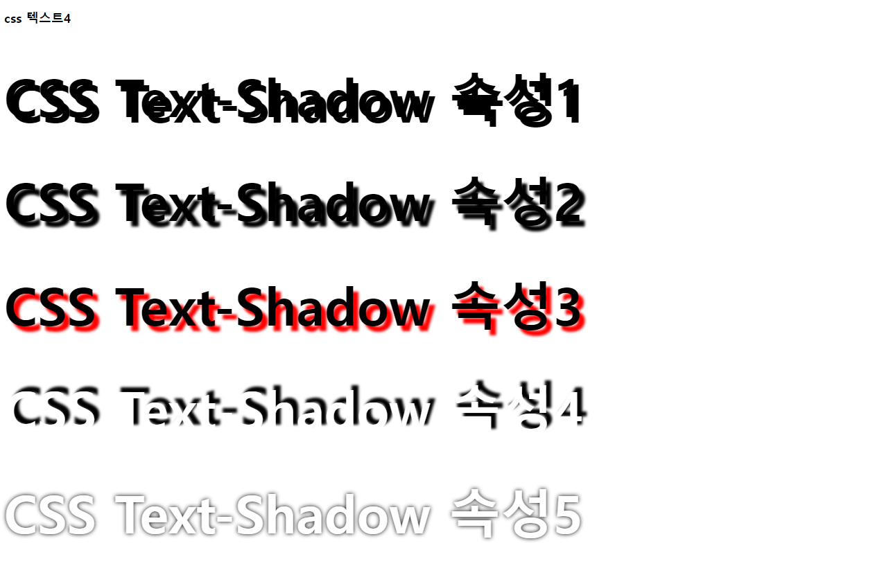
- white-space : 스페이스와 탭, 줄바꿈, 자동줄 바꿈을 어떻게 처리할지 결정한다. (nowrap, pre, pre-wrap, pre-line)
- text-overflow : 텍스트를 줄바꿈하지 않았을 때 넘치는 텍스트를 어떻게 처리할지 결정한다. (clip, ellipsis)
- overflow : 요소내의 콘텐츠가 너무 커서 모두 보여주기 힘들 때 어떻게 보여줄지 결정한다. (visible, hidden, scroll, auto)
<!DOCTYPE html>
<html lang="en">
<head>
    <meta charset="UTF-8">
    <meta name="viewport" content="width=device-width, initial-scale=1.0">
    <title>css 텍스트5</title>
    <style>
        p { display: inline-block; width: 200px; border: 1px solid red; }
        .txt1 { white-space: nowrap; overflow: hidden; text-overflow: clip; }
        .txt2 { white-space: nowrap; overflow: hidden; text-overflow: ellipsis; }
        .txt3 { height: 150px; overflow: scroll; }
        .txt4 { height: 150px; overflow-x: hidden; overflow-y: scroll; }
        .txt5 {
            border: 3px dotted deeppink;
            width: 400px;
            padding: 10px;
            white-space: nowrap;
            overflow: hidden;
            text-overflow: ellipsis;
        }
        .txt5:hover { overflow: visible;}
    </style>
</head>
<body>
    <h2>css 텍스트5</h2>
    <p class="txt1">Lorem ipsum dolor sit amet consectetur, adipisicing elit. Provident facilis itaque cupiditate doloremque recusandae nobis voluptate voluptatibus commodi dicta. Sunt aliquam soluta ea porro maiores, quia saepe culpa vitae perferendis?</p>
    <p class="txt2">Lorem ipsum dolor sit amet consectetur, adipisicing elit. Provident facilis itaque cupiditate doloremque recusandae nobis voluptate voluptatibus commodi dicta. Sunt aliquam soluta ea porro maiores, quia saepe culpa vitae perferendis?</p>
    <p class="txt3">Lorem ipsum dolor sit amet consectetur, adipisicing elit. Provident facilis itaque cupiditate doloremque recusandae nobis voluptate voluptatibus commodi dicta. Sunt aliquam soluta ea porro maiores, quia saepe culpa vitae perferendis?</p>
    <p class="txt4">Lorem ipsum dolor sit amet consectetur, adipisicing elit. Provident facilis itaque cupiditate doloremque recusandae nobis voluptate voluptatibus commodi dicta. Sunt aliquam soluta ea porro maiores, quia saepe culpa vitae perferendis?</p>
    <p class="txt5">Lorem ipsum dolor sit amet consectetur, adipisicing elit. Provident facilis itaque cupiditate doloremque recusandae nobis voluptate voluptatibus commodi dicta. Sunt aliquam soluta ea porro maiores, quia saepe culpa vitae perferendis?</p>
</body>
</html>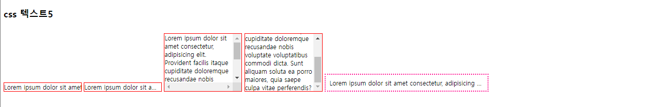
- font-family : 텍스트의 글꼴을 설정한다.
글꼴을 선택하는 방법
- 누구나 설치되어 있는 기본 글꼴을 사용
- 이미지로 처리
- 클라이언트에 글꼴을 다운로드 시켜 사용
- 웹 폰트를 사용
<!DOCTYPE html>
<html lang="en">
<head>
    <meta charset="UTF-8">
    <meta name="viewport" content="width=device-width, initial-scale=1.0">
    <title>css 텍스트6</title>
    <style>
        @font-face {
            font-family: 'TTLaundryGothicB';
            src: url('https://cdn.jsdelivr.net/gh/projectnoonnu/2403-2@1.0/TTLaundryGothicB.woff2') format('woff2');
            font-weight: 700;
            font-style: normal;
        }
        .fontface { font-family: 'TTLaundryGothicB'; }
    </style>
</head>
<body>
    <h2>css 텍스트6</h2>
    <p>옷에서는 아무 냄새가 나지 않는게 좋아</p>
    <p class="fontface">옷에서는 아무 냄새가 나지 않는게 좋아</p>
</body>
</html>
- font-weight : 텍스트릐 굵기를 설정. 기본 굵기는 400, 번위는 100~900
- font-size : 텍스트 크기를 설정. px, %, em, rem, ...
<!DOCTYPE html>
<html lang="en">
<head>
    <meta charset="UTF-8">
    <meta name="viewport" content="width=device-width, initial-scale=1.0">
    <title>css 텍스트7</title>
</head>
    <link rel="preconnect" href="https://fonts.googleapis.com">
    <link rel="preconnect" href="https://fonts.gstatic.com" crossorigin>
    <link href="https://fonts.googleapis.com/css2?family=Sunflower:wght@300;500;700&display=swap" rel="stylesheet">
    <style>
    .sunflower-light {
        font-family: "Sunflower", sans-serif;
        font-weight: 300;
        font-style: normal;
      }

      .sunflower-medium {
        font-family: "Sunflower", sans-serif;
        font-weight: 500;
        font-style: normal;
      }

      .sunflower-bold {
        font-family: "Sunflower", sans-serif;
        font-weight: 700;
        font-style: normal;
      }
      </style>
<body>
    <h2>css 텍스트</h2>
    <p class="sunflower-light">인권에 대한 무시와 경멸이 인류의 양심을 격분시키는 만행을 초래하였으며, 인간이 언론과 신앙의 자유, 그리고 공포와</p>
    <p class="sunflower-bold">인권에 대한 무시와 경멸이 인류의 양심을 격분시키는 만행을 초래하였으며, 인간이 언론과 신앙의 자유, 그리고 공포와</p>
    <p class="sunflower-medium">인권에 대한 무시와 경멸이 인류의 양심을 격분시키는 만행을 초래하였으며, 인간이 언론과 신앙의 자유, 그리고 공포와</p>
    <p>인권에 대한 무시와 경멸이 인류의 양심을 격분시키는 만행을 초래하였으며, 인간이 언론과 신앙의 자유, 그리고 공포와</p>
    <p>인권에 대한 무시와 경멸이 인류의 양심을 격분시키는 만행을 초래하였으며, 인간이 언론과 신앙의 자유, 그리고 공포와</p>
</body>
</body>
</html>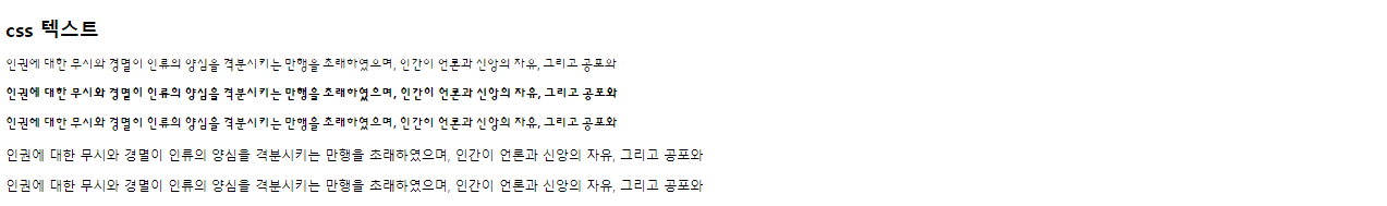
'Web > css' 카테고리의 다른 글
| CSS 우선순위, Custom properties, 2D, Animation (0) | 2024.04.13 |
|---|---|
| 레이아웃, 플렉스(flex) 레이아웃, 미디어 쿼리(media query) (0) | 2024.04.12 |
| CSS 배경, 디스플레이, 폼, 위치 (0) | 2024.04.10 |